

Most watch releases this year have asked you to admire something. This one asks you to look twice.
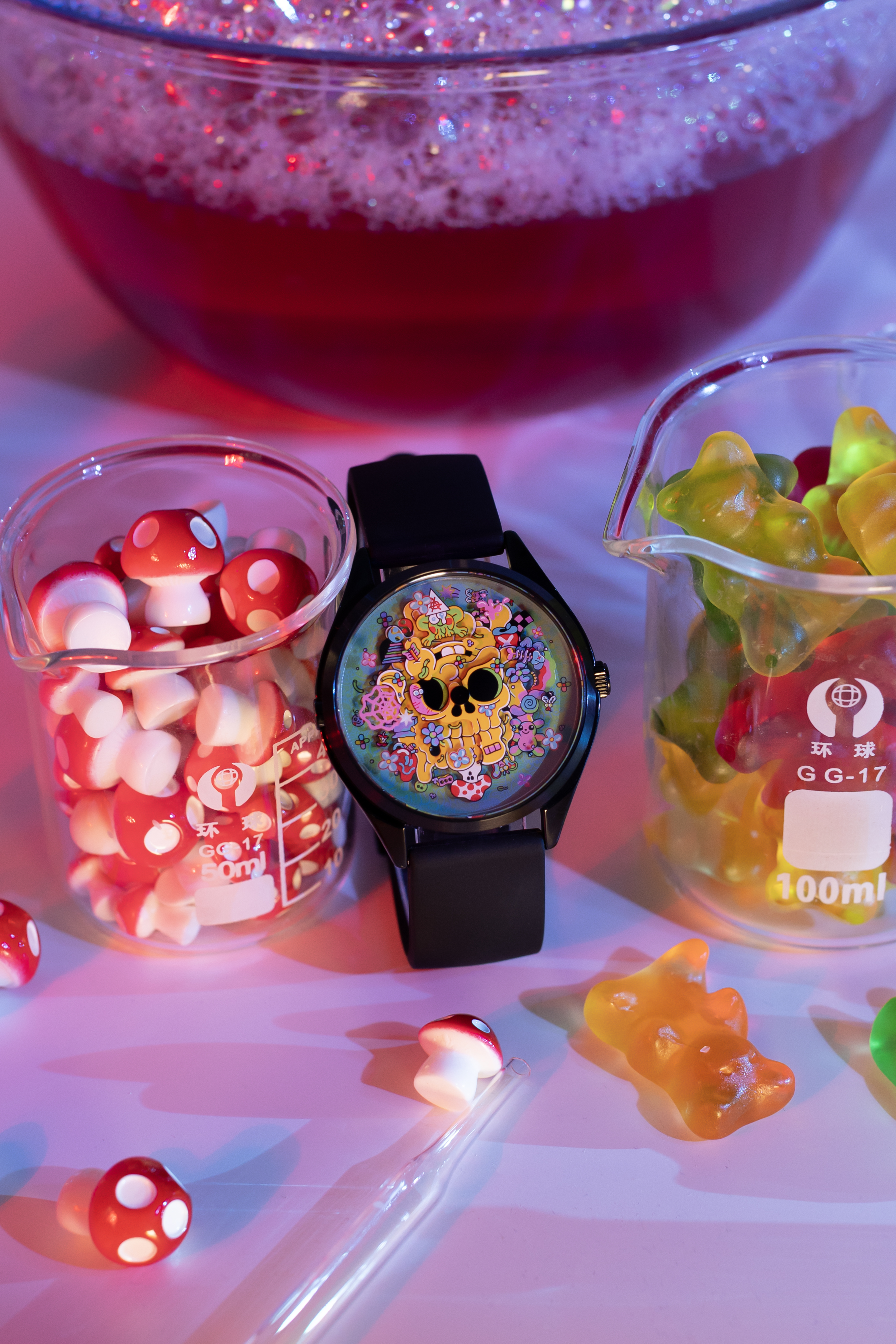
Mr Jones Watches has launched Time Warp, a 300 piece limited edition designed by the illustrator Sam Taylor, and the first thing you notice is that there is far too much going on. A pastel gummy bear. A frog that looks like it has just discovered meditation. A worm, apparently at peace with the world. Mushrooms. Colour everywhere, arranged with the discipline of a dropped box of sweets. And in the middle of it all, a yellow skull, turning slowly around the dial like it has somewhere to be.
Then the skull goes upside down and stops being a skull. Flip it and you get a goofy face grinning back at you. Same shapes, same lines, completely different creature. Nothing on the dial has changed except your angle on it.
That is the whole watch, really. Everything else is decoration.
The Victorians got there first

Taylor took the idea from Victorian reversible illusions, those printed heads that turn into a different head when you rotate the page. A young woman becomes an old crone. A pope becomes a devil. They were parlour entertainment, sold as novelties, and they were also the nineteenth century quietly working out something that psychology would not properly formalise for another hundred years: perception is not passive. Your brain is not receiving the image. It is deciding on it.
Which is a slightly grand way of describing a gummy bear, I accept. But it is what makes the watch more than a nice bit of illustration.
Taylor put it better than I would. “The design changes and becomes mixed-up, then resolves at certain times, representing how sometimes things are confused but then out of nowhere they clear up. You can be having a bad day and then, boom, one little thing happens and your whole perspective flips.”
Once an hour, the chaos on the dial resolves and the skull sits cleanly in view. Once an hour, everything makes sense. If you have ever had a week where that felt like an accurate ratio, this is a watch designed for you.

Reading it is optional, which is the point
Officially, the frog marks the minutes and the mushroom points to the hour. Practically, you are going to look at your phone.
Mr Jones has been open about this for years, and it remains the most clear-eyed position anyone in the industry has taken. Once the phone took over timekeeping, the watch stopped being an instrument and became something else. Most of the trade responded by pretending this had not happened, doubling down on chronometer certification and water resistance for pressures no human will experience. Mr Jones responded by asking what a watch is actually for now, and building around the answer.
The answer, it turns out, is that it is for saying something. To yourself, mostly, forty times a day when you glance down.
The company has been circling mortality since the beginning. Its founding piece told the wearer, in as many words, that they were going to die. Time Warp takes the same skull and refuses to let it stay solemn. Turn it over and death is pulling a face at you. That is not a softening of the idea. It might be the sharpest version of it. Memento mori that also thinks you should lighten up.

What you actually get
The case is 37mm across and 46mm lug to lug, black PVD coated stainless steel, with sapphire glass and a single jewel quartz movement inside. 5ATM, 18mm black silicone strap, twelve months of guarantee. £245, or $325, or €285, depending on where you are standing. Designed, printed and assembled in London.
Nobody is buying this for the movement and Mr Jones is not asking you to. The quartz is there to turn the picture, and there is something honest about a brand that treats the mechanism as a delivery system rather than the entire personality of the product.
37mm is small by the standards of the last decade and exactly right by the standards of a dial you are meant to read as an image. Give this design 42mm of real estate and it stops being a jewel and starts being a poster.

Worth it?
Taylor has worked with Nike, Vans, Apple, Google and Converse, and this is his first watch. That is usually a warning sign. Illustrators tend to treat a dial as a very small canvas, forget that it rotates, and produce something that looks superb in the render and nonsensical on the wrist.
This does the opposite. The rotation is not a constraint he worked around, it is the mechanism of the joke. The artwork needs the hands to exist. You cannot print this on a t-shirt and get the same thing, which is a higher bar than most artist collaborations clear.
Three hundred pieces, sold direct, gone when they are gone.
I have no idea what the worm means. Taylor says he does, and that you are welcome to decide for yourself. Given the watch is an argument about perspective, that seems like the correct amount of instruction.

Leave a Reply